Maze Health
In theory, a company rebranding is done in a thorough fashion, with all the business assets and opportunities in play simultaneously. But, as we know, reality doesn’t always work that way.
Situation
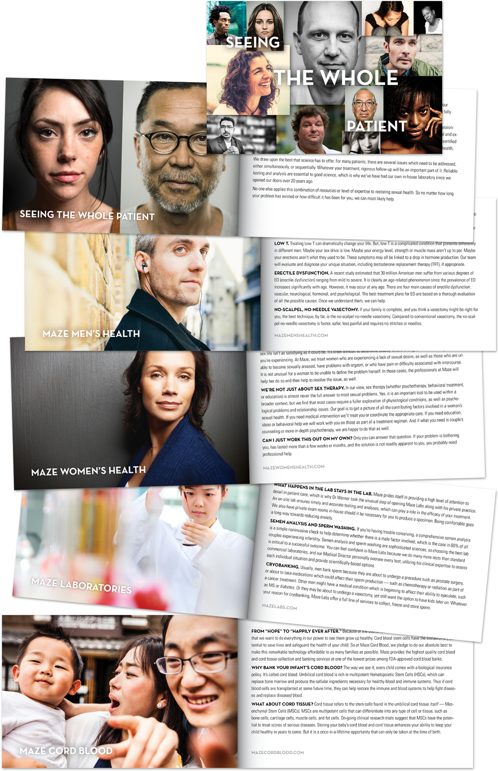
We first engaged with the highly-regarded medical director of the Maze group, Dr. Michael Werner, to rebrand his first and original business unit, a medical practice (New York Andropause Center) specializing in men’s sexual and reproductive health. Our initial customer research quickly revealed the truth of their brand: namely, that Dr. Werner’s passion for family had organically led him, over time, to expand the group to include women’s sexual health, an onsite laboratory and even a Cord Blood Bank. While the Maze team was laser-focused on keeping each group distinct (out of sensitivity to the patients’ needs), we saw the opportunity for creating a larger, more holistic footprint in the Northeast, by unifying the unrelated identity of the groups.
![]()
While clearly separate in terms of customers, life-stage, and business models (Cord Blood is an e-commerce transaction), all of the Maze divisions had at their core a commitment to supporting the most important and intimate relationships. Thus, it made good business sense to unite each separate unit under a single brand identity system.
Solution
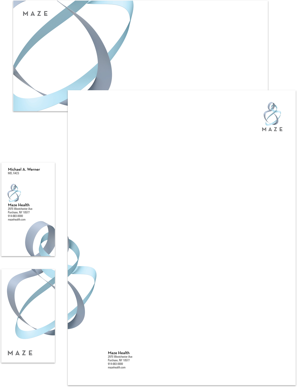
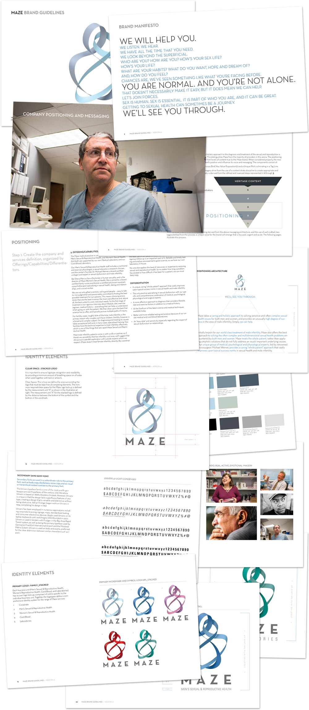
“Maze” was a name associated strictly with Dr. Werner’s cord blood business, and was actually an acronym (M.A.Z.E.) comprised of the initial letters of his four sons’ names. “Maze” is an unusual word. It’s also short and easy to remember, and it’s subliminally representative of the often intertwined and complex issues associated with infertility and sexual dysfunction. For these reasons we recommended adopting the name for the entire brand. We then designed a lyrical marque (at left) to reinforce the group’s pursuit of rewarding human interactions. The intertwining, ribbon-like forms evoke the image of an embracing couple or parent and child, and are not unlike a DNA strand, underscoring the scientific foundation of the care Maze provides. Color imparts other visual cues, and is used to represent the breadth of specialties within the practice.
Build out of the brand materials and websites for each division occurred over time … with Maze Cord Blood going live in October 2016. What began modestly as a refresh of a single website expanded to a comprehensive brand makeover comprised of a complete identity system, four websites, end-to-end patient and partner collateral, online and print advertising, plus custom development of a HIPAA-compliant workflow management system.