
Corporate Identity
Through consistent use, most any logo can become a vivid shorthand. The priority is to find an expressive device, an idea — preferably product-related — that reinforces the company name. Although this is often conceptual, a logotype distinguished in this manner works harder, has greater visual impact and is easier to remember. It possesses the promise of meaning and the pleasure of recognition.
Examples of our logo designs and their implementations are featured at left. Rebranding cases include their previous versions, shown below.
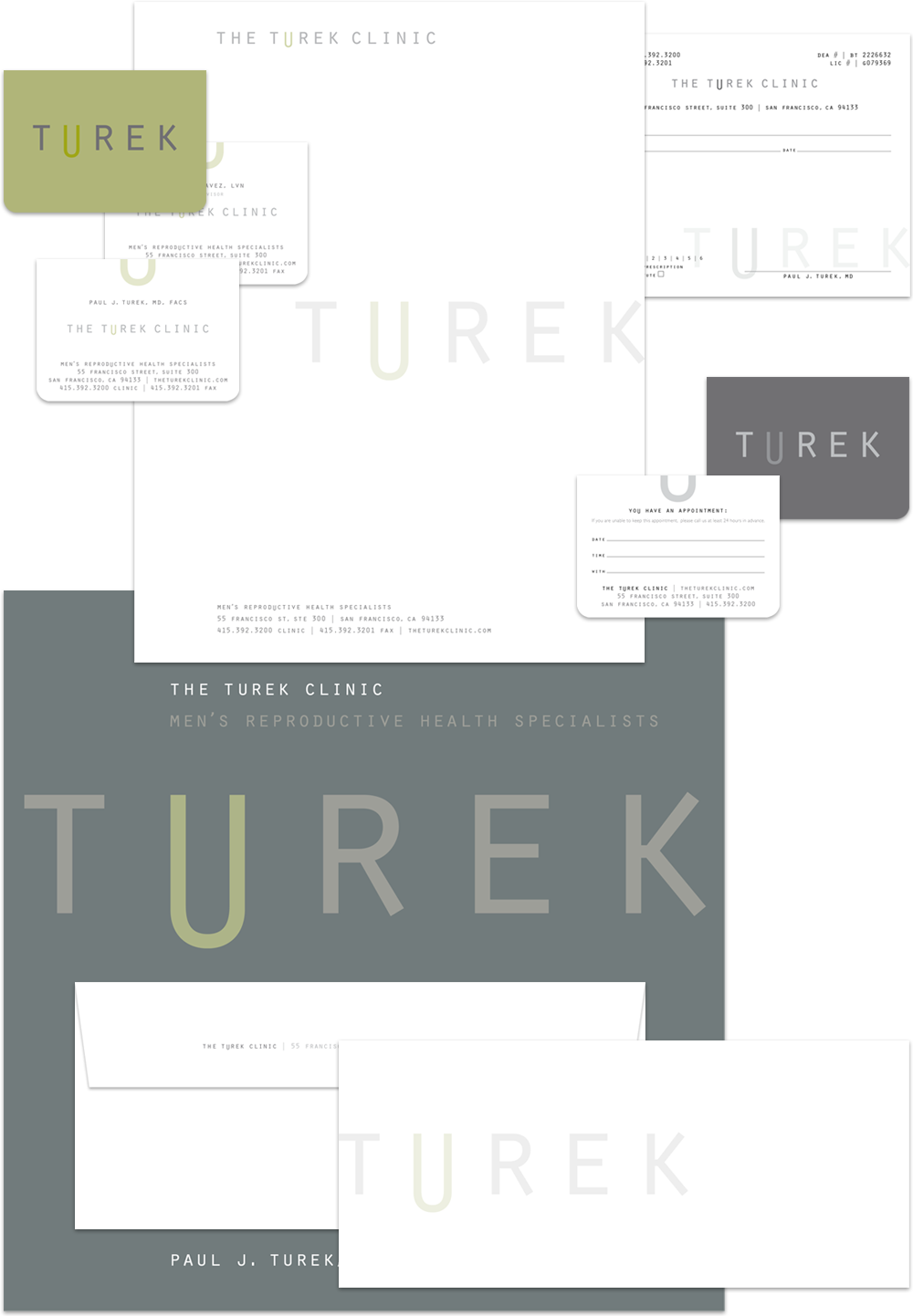
The Turek Clinic
After 20 years on staff at UCSF, Dr. Paul Turek, a urologist and world renowned expert on the molecular biology of genetic infertility, founded San Francisco’s Turek Clinic, an international destination for male fertility and men’s sexual healthcare. Given that sexual dysfunction and reproductive infertility are delicate matters, we felt the core brand identity should provide a clue as to the focus of the clinic, but in a way that was tasteful and understated. Our goal was to create an identity that was reserved and professional in tone, while allowing for the smile that is at the core of Dr. Turek’s personality.
AODocs
![]()
AODocs is an innovative document management platform for Google Apps. They needed a new logo that quickly communicated their integration with the search giant, while also cutting through the cacophony of google-ness in the Google Apps Marketplace. They also hoped it would project their core value proposition quickly and offer a framework for several enterprise-grade products as they expanded globally.
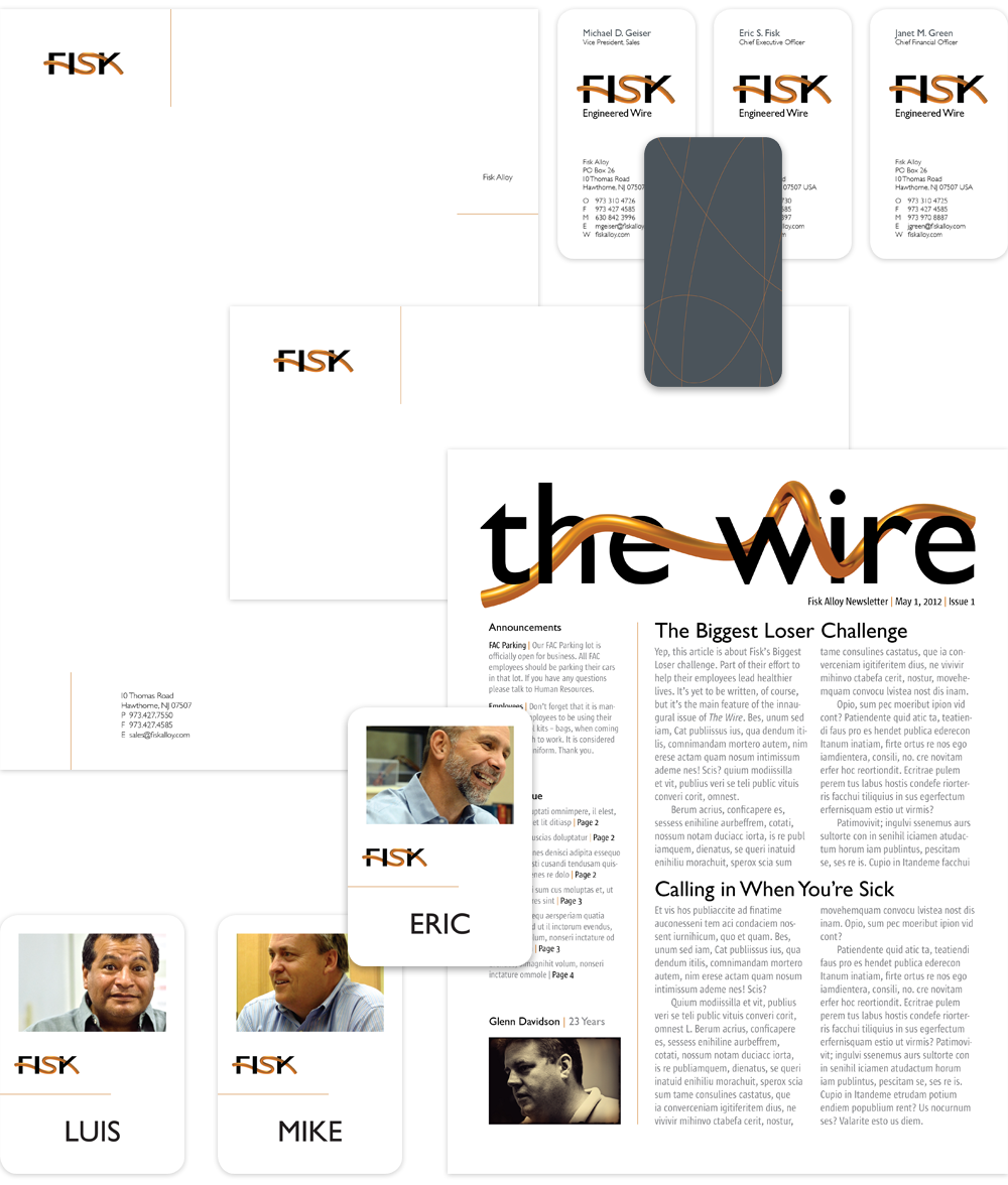
Fisk Alloy
![]()
![]()
Fisk Alloy engineers wire for the automotive, medical, aerospace, defense and electronics industries. Founded in 1973, their old brand identity didn’t project the global leadership position Fisk owns today. The new logo, thus, had to achieve several objectives. As a comprehensive expression, a new identity had to accurately reflect the personality of multiple company divisions. It also needed to bring Fisk into the new century and beyond, and speak to the company’s global presence (hence the use of European formats for company literature and business papers). Finally, it had to reconcile the sometimes conflicting ideas of stability & reliability against invention & creativity. Thus, the juxtaposition of thin, rigid wire elements against clean backgrounds, and photography that turns an industrial factory, gritty machinery and wire into art.
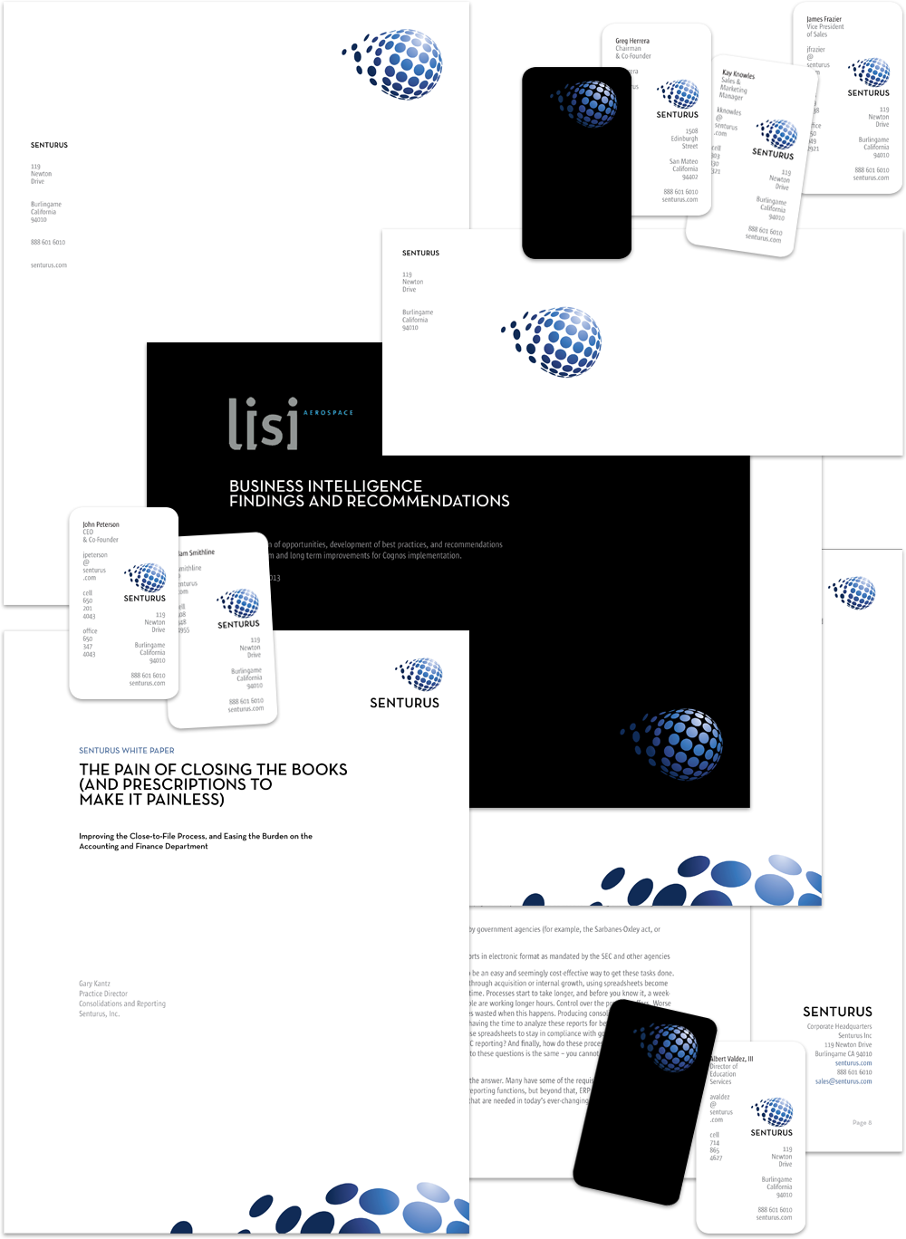
Senturus
![]()
For years businesses have been expanding further into the digital universe, collecting massive quantities of data along the way. Making sense of it has become the challenge. Senturus is a business intelligence company, helping clients unravel the immense value that is locked in their data and putting it to work for business gain. Essentially, creating clarity from chaos. One Degree redesigned the Senturus brand identity with this mantra in mind, and did a ground-up development and production of their transactional website as well.
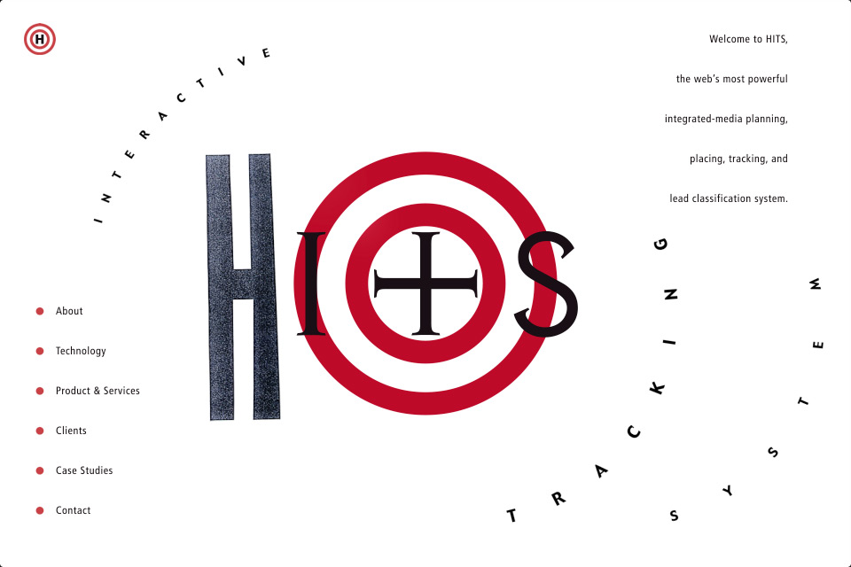
H.I.T.S.
As advertising’s era of lavish media budgets and leisurely time lines (ahh, the good old days) gave way to accountability and efficiency, the need for more effective lead tracking and classification, media reporting and optimization tools became more urgent. HITS (Halloran Integrated Tracking System) was designed to provide exactly that, by giving advertisers and their agencies a means to better target customers and track their engagement with all forms of media. ‘H’, which stands for ‘Halloran’, was the name of the company that developed this technology. Combining this letter form with other elements communicates the benefit of the HITS system. We also animated it in a fun way to welcome visitors to the HITS website.
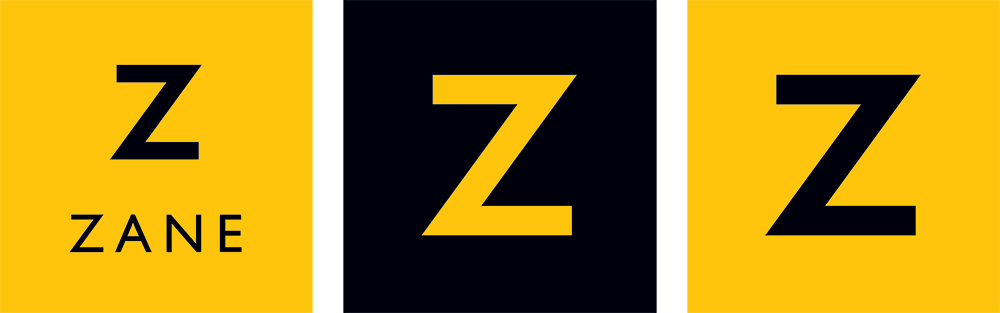
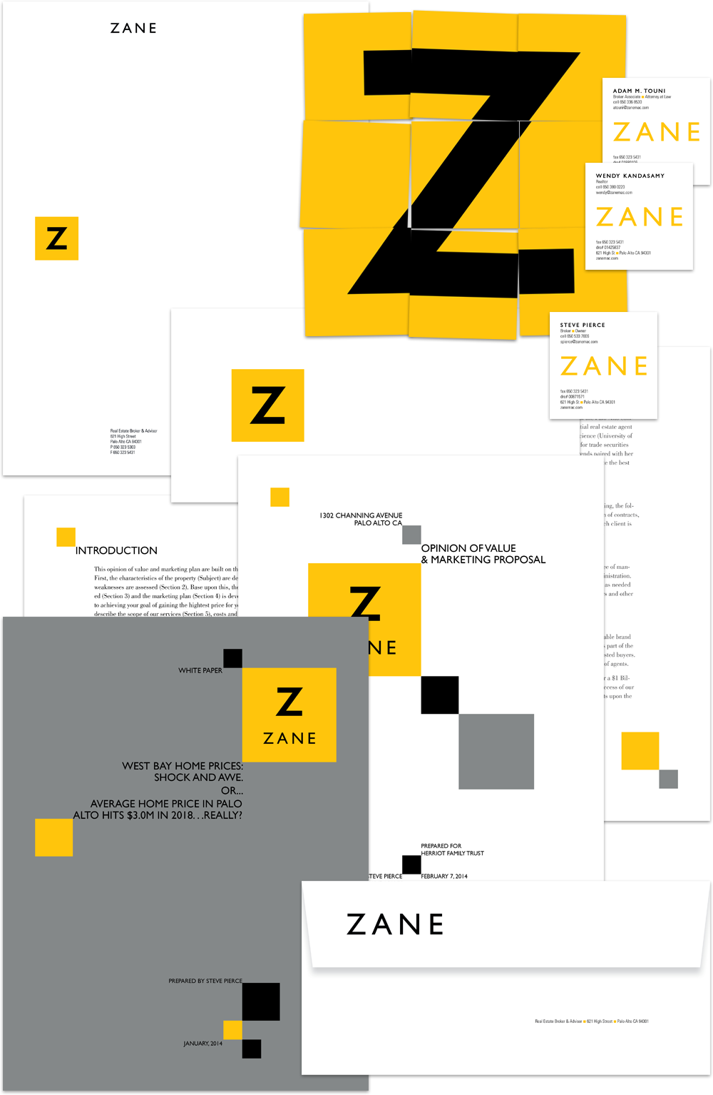
Zane MacGregor
![]()
Zane MacGregor is a sophisticated real estate brokerage in Palo Alto, California. They contacted us with aspirations to update their image, which was showing its age. The previous logo was designed to communicate professionalism, akin to a law firm, and positioned them effectively versus early competition. Since, however, real estate has exploded on the Peninsula and, although Zane has been extremely successful, their image no longer represented leadership nor innovation … two characteristics highly valued by Peninsula home buyers. Our charge was to maintain the professional tone while injecting authentic elements of energy, originality, and humanity. Using a classic san serif font, we designed a clean, welcoming logotype that extended the poise of the original, while also projecting the strength and confidence it lacked. We also recommended dropping MacGregor from the firm name as it was no longer relevant and difficult to spell correctly when searching.
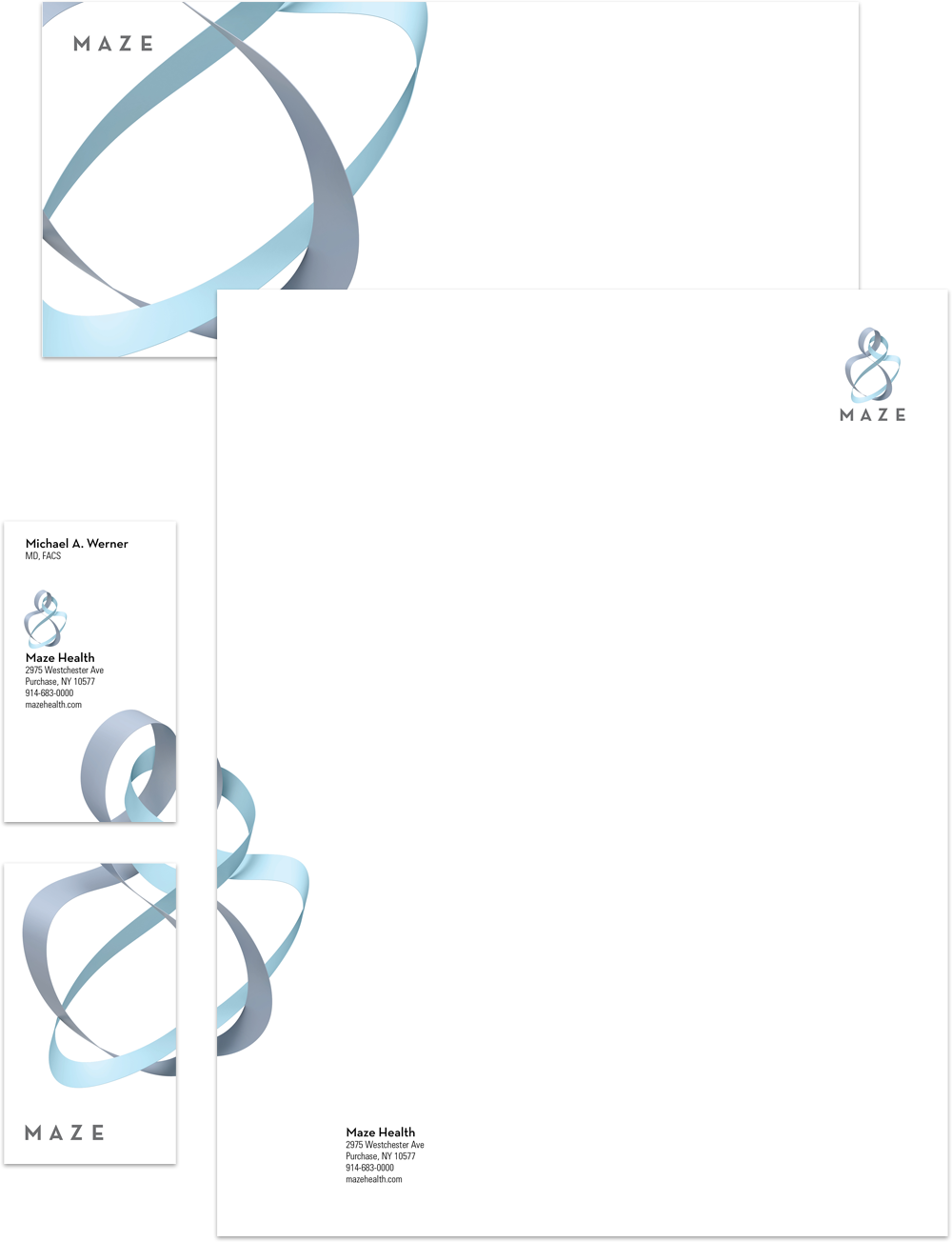
Maze
![]()

We designed a lyrical marque to unify previously disparate units that share a common goal — rewarding human interactions. The intertwining, ribbon-like forms evoke the image of an embracing couple or parent and child, and are not unlike a DNA strand, underscoring the scientific foundation of their care. Color provides other visual cues, and is used to represent the breadth of specialties within the practice.
Route One
Route One was an early participant in the shift from traditional to digital media delivery methods; a landscape that has since evolved and matured as the digital pipeline has gotten wider and faster, and compression technologies have improved. Route One saw the potential for moving large media files around the globe, especially for broadcast, via the Internet instead of sending tapes, the standard of their day.
(F)un Boxx
Renowned architect, Ana Williamson, partnered with fellow Menlo Park company, Mediterraneo Design Build, to develop and build a one-of-a-kind playhouse for Dreams Happen, an annual fund raiser benefitting Rebuilding Together Peninsula (RTP). The initial playhouse brainstorming session yielded its underlying theme: that the best play experiences are those that tap a child’s imagination. It’s common, in fact, to observe children tiring of a specific toy and end up playing with the box it came in. The team embraced the idea of “the box” and designed a playhouse that allows all who enter to make it their own. Not a box. An un-box. Our logo design played off this idea, and was further inspired by the bold, bright colors Ana and the team used in the design of the box itself, making it human, fun and most important, playful.
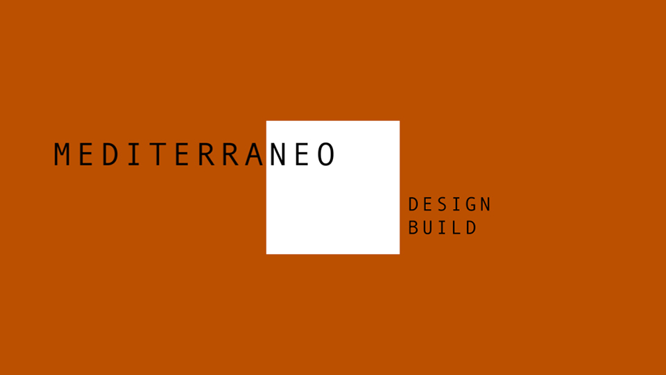
Mediterraneo
![]()
Mediterraneo’s partners felt their name pigeon-holed them as builders specializing in Mediterranean-style home design and construction, thus wanted to abandon it. But twenty years of equity is a lot to sacrifice, so we redesigned the logo instead. We married “Mediterraneo” with a square field to emphasize the last three letters, N-E-O, representative of, “new space.” We developed a color palette dominated by terracotta and cement — two prominent colors in California construction, and shot gritty photography depicting their crews hard at work, and architectural-style imagery of their projects.
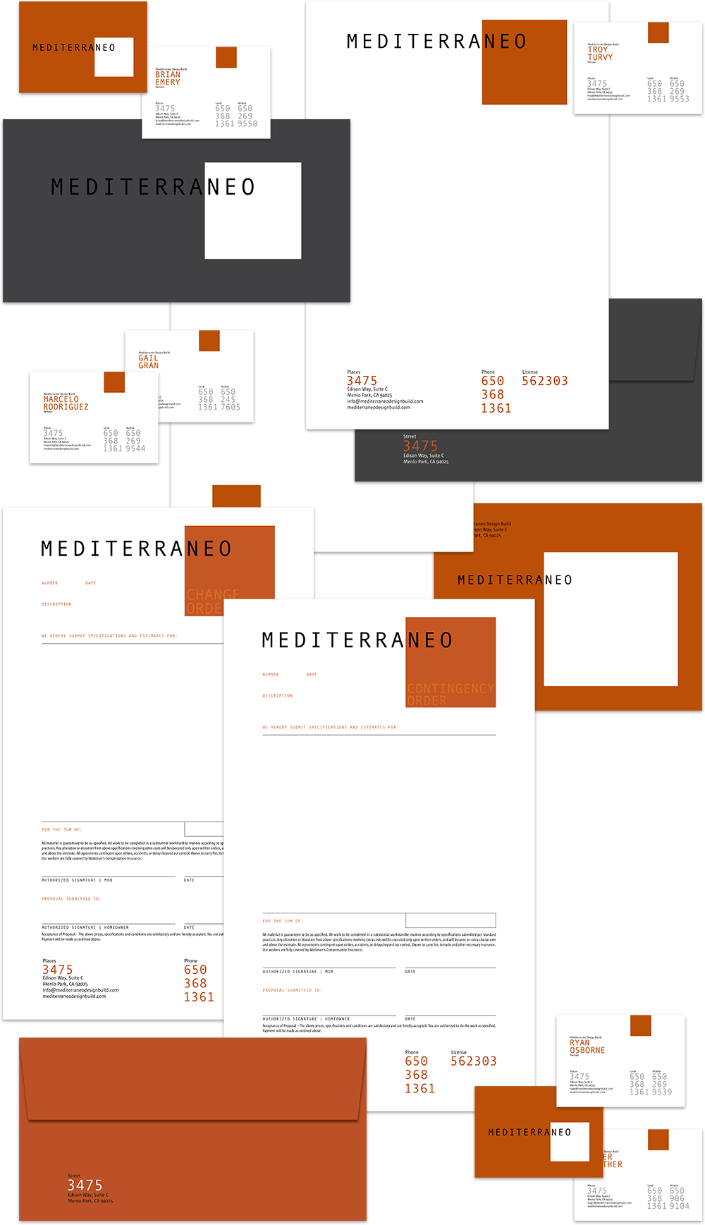
Justin Pauly Architects
Based in Monterey and specializing in green building practices and site-specific design, as well as city and regional planning, award-winning architect Justin Pauly sought out One Degree for a brand update. His goal was a simple yet evocative image that still managed to convey his areas of passion. The outcome was an abstract shape that speaks to both the originality and sustainable nature of the spaces he designs.
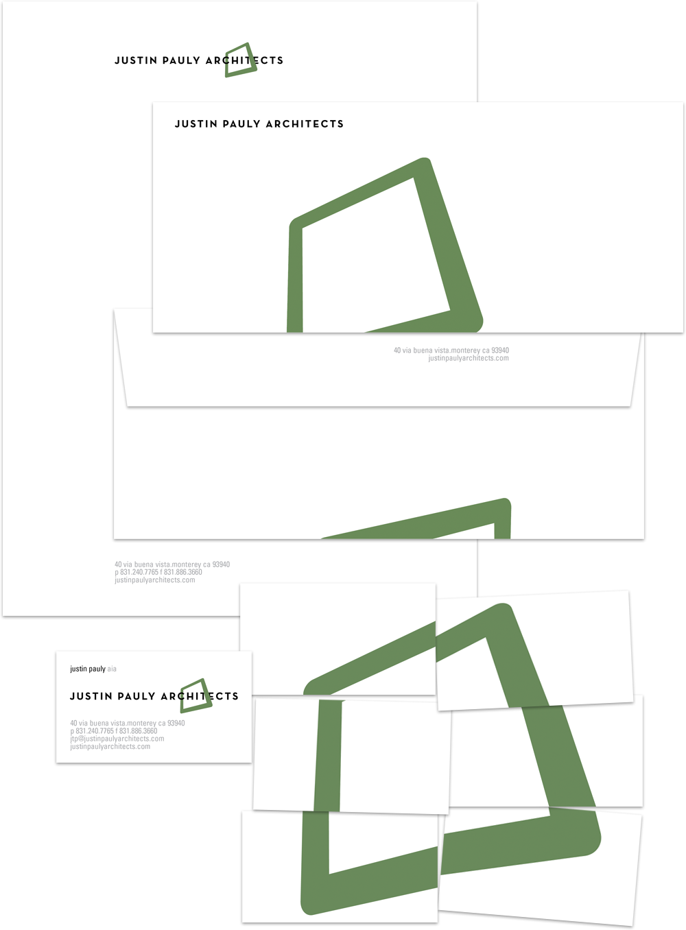
Baseball/Life
A tiny fraction of high school athletes achieve success at the professional level, in any sport. Yet today, many of them (and their parents) are fed upon by a youth sports industry that robs children of much of their youth, and feeds an unreal expectation of what’s possible in sport for the vast majority. Founded in late 2015, Baseball/Life fundamentally departs from this process. It is designed to assist amateur ballplayers at all levels in developing the physical and mental skills required to reach their potential, but more importantly, Baseball/Life believes in preparing young athletes for life after sport, which is an inevitability no matter how much success one achieves.
Vancouver Cardinals
Some of the most famous Major League baseball players play in the American Legion baseball system between the ages of 16 and 18. The Vancouver Cardinals, a Washington State program about to enter its 34th season, and from which hundreds of college and professional ballplayers have emerged, is embarking on an effort to reinvigorate the program. We were called upon to create a new identity, uniform graphics and other support materials.